



Зміст статті
- What Are Google Ads Banners and How Do They Work
- Current Google Ads Banner Sizes
- The Most Effective Banner Sizes (Based on Real-World Practice)
- Google Ads Responsive Display Ads
- Technical Requirements for Google Ads Banners
- HTML5 Banners — When You Actually Need Them
- How to Choose the Right Banner Size for Your Goal
- Which Banner Sizes Are Non-Negotiable (Must-Have Set)
- Banner Design: What Actually Works
- Common Mistakes When Creating Banners
- How to Automatically Cover All Banner Sizes
- Conclusion
What Are Google Ads Banners and How Do They Work
Google Ads is more than just search advertising. Most people know it from ads in search results, but there’s also the Display Network — a separate system with over 2 million websites, apps, and video platforms. This is exactly where banners appear — let’s take a closer look at what they are and how they work.
In short: a banner is a graphic or responsive ad displayed on Google Display Network (GDN) partner resources. A user is reading an article, checking their email, or watching a video — and sees your creative.
Types of banner advertising in Google Ads
To understand the formats, it helps to first know what types of Google Ads exist in general — search, display, video, shopping. The Display Network supports four main ad formats. Here are the banner types supported by Google Display Network:
- Image banners — the classic format with fixed dimensions. JPG, PNG, or GIF, static or animated — your choice. The only downside: each size requires a separate file.
- Responsive display ads — a format that automatically adjusts its size and appearance to fit each placement across the network. You upload headlines, descriptions, images, and a logo — Google assembles the combination for each specific platform.
- HTML5 banners — interactive ads with animation and user engagement capabilities. More complex to produce, but offer maximum potential for showcasing a product. Relevant for automotive brands, e-commerce, and premium segments.
- Video banners — short video clips displayed on YouTube and partner websites. Technically a separate format within the Google Ads system, but often used alongside display campaigns.
Where display ads appear
The Google Display Network — where advertisers place their banners — reaches approximately 90% of the world’s internet audience. Banner ad placements within GDN span news sites, blogs, portals, online stores, email services, and mobile apps.
GDN and search advertising are two distinct tools with different logic. Understanding what Google display advertising is means knowing where and how your banner appears in front of users.
Specific ad placements depend on targeting settings: site topics, audience interests, remarketing lists, or specific URLs. The ad appears within an ad unit — a designated space on the page that the site owner has connected via Google AdSense.
This is exactly why size matters: every ad unit has specific parameters. If your banner doesn’t match the formats supported by a given site — you simply won’t appear on that platform.
Why banner size affects results
There are several direct connections between format and advertising performance.
First, reach. Some formats are supported by 80–90% of platforms, others by only 20–30%. If you only have one non-standard format, you’re automatically limiting your audience.
Second, placement. A 300×250 banner is typically placed in the middle of content — where the reader is already engaged. A 728×90 banner sits in the page header, capturing the first glance. Different positions produce different CTRs even with identical designs.
Third, visibility. The large 300×600 format takes up a significant portion of the screen — it’s hard to miss. A small 320×50 on mobile is easy to ignore. This doesn’t mean small formats don’t work, but their role is different: ad frequency, brand awareness, remarketing.
💡 Pixel dimensions determine not only technical specifications, but also where and how your ad will appear in front of the user.
Current Google Ads Banner Sizes
Google supports over 20 standard formats for the Display Network. But knowing all of them doesn’t mean using all of them. What matters is understanding which types of online banners deliver the greatest reach and the best real-world results.
Most popular sizes (TOP 5)
There are five formats that, according to Google, generate the highest number of impressions and the widest availability across platforms. If you have limited time or production budget — start with these.
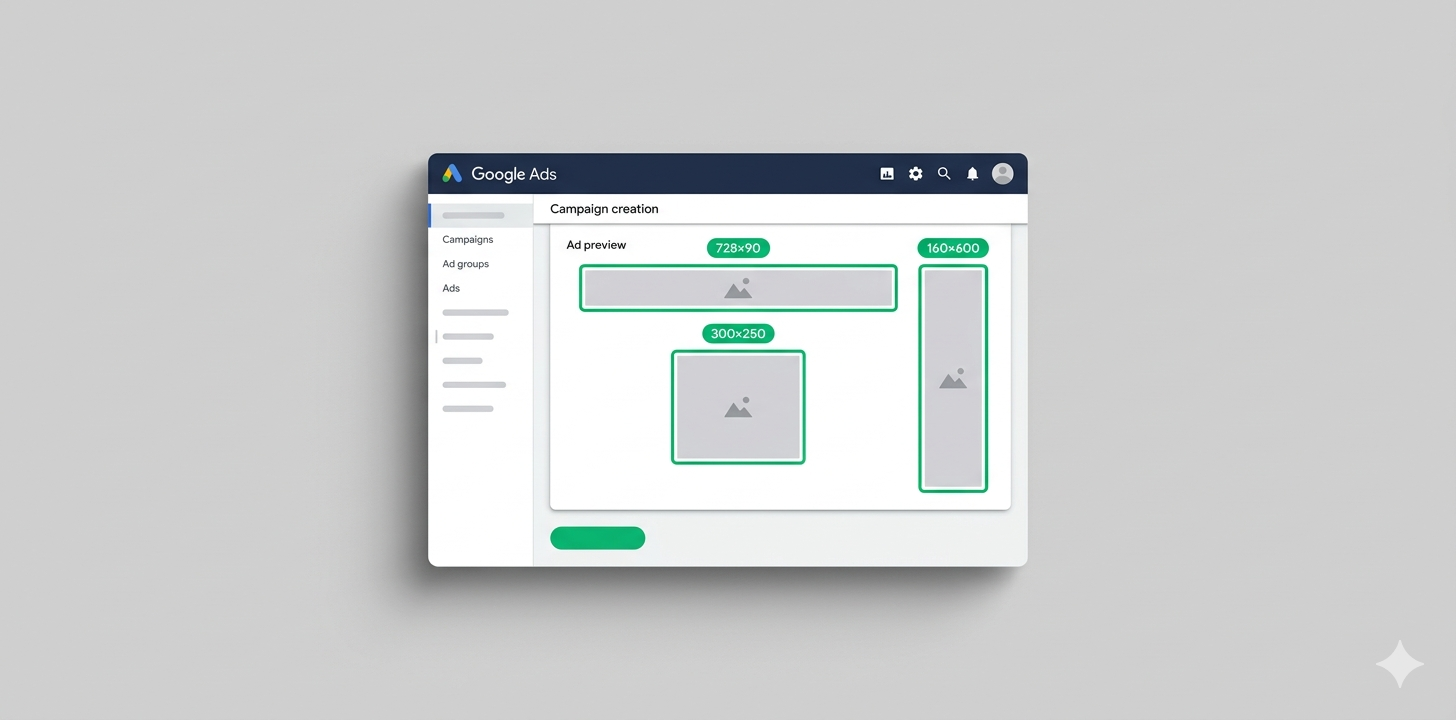
300×250 — Medium Rectangle
The most popular format in display advertising. Supported by virtually all websites and placed in various zones: sidebar, middle of content, below articles. Looks great on both desktop and mobile. If you can only have one banner — this is the one.
728×90 — Leaderboard
A wide horizontal banner traditionally placed at the top of the page or between sections. Its large width makes it highly visible on initial page load. The primary format for desktop traffic.
300×600 — Half Page
A large vertical format — one of the biggest in the Display Network. It takes up half of a standard sidebar and attracts significantly more attention as a result. According to Google, it has the highest viewability rate of all formats. Ideal for branding campaigns.
320×100 — Large Mobile Banner
Twice the height of a standard mobile banner. Placed at the top or bottom of a mobile site. When used in the zone below the navigation menu, it delivers solid visibility without aggressively interrupting content.
320×50 — Mobile Banner
The standard mobile format — a thin horizontal strip at the bottom or top of the screen. Takes up minimal space but appears across a vast number of mobile sites and apps. Essential for remarketing and brand awareness campaigns.
Full list of standard sizes
Google supports many more formats. Here is the complete list, current as of today:
| Size | Name | Typical placement |
|---|---|---|
| 300×250 | Medium Rectangle | Sidebar, content |
| 336×280 | Large Rectangle | Content, below articles |
| 728×90 | Leaderboard | Header, between sections |
| 300×600 | Half Page | Sidebar |
| 160×600 | Wide Skyscraper | Sidebar |
| 120×600 | Skyscraper | Sidebar (legacy sites) |
| 970×90 | Large Leaderboard | Wide header |
| 970×250 | Billboard | Wide header, premium |
| 250×250 | Square | Content |
| 200×200 | Small Square | Content |
| 468×60 | Banner | Horizontal block |
💡 An important note: not all of these formats are equally available on modern websites. Some — like 120×600 or 468×60 — are leftovers from early web design standards and are rarely seen today. Focus on the top five and mobile formats.
Mobile device sizes
Smartphones have long overtaken desktop in terms of traffic. This means display advertising without mobile formats is advertising for only half your audience.
Google supports the following mobile formats:
| Size | Name | Notes |
|---|---|---|
| 320×50 | Mobile Banner | Base format, maximum reach |
| 320×100 | Large Mobile Banner | More noticeable, higher CTR |
| 300×250 | Medium Rectangle | Universal, works on mobile too |
| 250×250 | Square | For narrow content zones |
The 320×50 format is essential for any display campaign with a mobile audience. It takes up minimal space and appears across an enormous number of apps and mobile sites. Not the highest CTR, but unmatched reach.
Online banners for mobile users are primarily a matter of context. A person is looking at their phone on the subway or waiting in line. The ad needs to be understood in 2 seconds.
Large formats (Branding / Reach)
For reach and brand awareness campaigns, there is a separate class of large formats.
970×250 — Billboard. A wide, tall banner that spans the full width of the content area on widescreen sites. If a competitor bought this format on a leading news portal — you definitely noticed it. Primarily used in programmatic and on premium platforms.
970×90 — Large Leaderboard. A wider version of the standard Leaderboard. Works on sites with wide layouts — news portals, large media outlets, tech publications.
300×600 — Half Page. Formally included in the previous section as well, but in a branding context it’s a distinct tool. The large size allows for a quality image, a full message, and a CTA with no compromises.
These formats cost more and aren’t available on every platform, but for product launches, seasonal campaigns, or premium segments, they fully justify the investment.
The Most Effective Banner Sizes (Based on Real-World Practice)
Formats with the highest CTR
CTR (click-through rate) is the percentage of clicks out of the total number of impressions. A normal CTR for display advertising is 0.1–0.3%. A good one is 0.5% and above.
Based on display network campaign data, the highest CTR is consistently delivered by:
- 300×250 — thanks to its integration within content. When a banner sits between paragraphs of an article rather than on the periphery, users notice it naturally.
- 300×600 — due to its size. A large image can carry a powerful visual message and a CTA that’s hard to ignore.
- 320×100 on mobile — compared to the standard 320×50, this format is more noticeable and delivers a CTR 1.5–2x higher with similar reach.
💡 An important note: CTR depends heavily on creative quality and audience relevance. Even a 300×250 with poor design and a weak offer will underperform a 728×90 that’s done well.
Formats with the greatest reach
Reach is the number of unique users who saw your ad. If the goal is maximum exposure, formats are prioritized differently.
- 300×250 leads here too — simply because it’s supported by almost every site in the network. It’s the only format where CTR and reach both rank at the top.
- 728×90 provides wide coverage across desktop platforms. Most high-traffic sites have an ad block below the header in exactly this size.
- 320×50 — maximum reach among mobile formats. If your audience is primarily on phones, you’re leaving impressions on the table without this format.
Which banners actually generate leads
For lead generation, the best results come from a combination of two or three formats: 300×250 as the primary, 300×600 for premium platform reach, and 320×100 for mobile traffic. This strikes a balance between reach, CTR, and placement quality.
In e-commerce, where showing the product matters, 300×600 often outperforms competitors — there’s enough space for a product image, price, and a “Buy” button.
For services and B2B niches where decisions take longer, remarketing matters more: here, 300×250 and 728×90 on desktop follow the audience across different sites and gradually build brand familiarity.
Effective banner advertising isn’t about one great banner — it’s about a system of formats, each playing its own role in the chain of audience touchpoints.
Google Ads Responsive Display Ads
Responsive ads are one of Google’s biggest innovations in display advertising in recent years. Instead of preparing 10–15 different banners, you upload a set of assets and the system assembles the ads itself.
How responsive ads work
The principle is simple: you provide Google with the “raw material” — images, headlines, descriptions, a logo — and the algorithm automatically tests combinations and selects the right size for each placement.
What you need to prepare:
- up to 15 images in various aspect ratios
- up to 5 headlines (up to 30 characters each)
- up to 5 long headlines (up to 90 characters)
- up to 5 descriptions (up to 90 characters)
- a logo in both square and horizontal versions
Google tests different combinations and gradually amplifies those that deliver better results. It’s essentially a built-in A/B test running without any input from you.
Responsive ads appear in all sizes supported by GDN — from the small 320×50 to the large 970×250. One set of assets covers the entire network.
Which sizes you don’t need with responsive ads
If you’re using responsive ads as your campaign’s primary format, the need for image banners in specific sizes decreases significantly.
Responsive ads cover the vast majority of placements on their own. There is one exception, however: some premium platforms and exclusive ad positions only accept specific image formats — for example, 970×250 for Billboard or HTML5 for interactive units.
So abandoning image banners entirely isn’t advisable. The smart strategy is: responsive ads as the foundation + 2–3 image formats for specific platforms and A/B testing.
Image and logo requirements
For responsive ads to look good across all formats, images must meet Google’s technical requirements.
Marketing images:
- Landscape (1.91:1): minimum 600×314 px, recommended 1200×628 px
- Square (1:1): minimum 300×300 px, recommended 1200×1200 px
- Maximum file size — 5 MB each
Logo:
- Square (1:1): minimum 128×128 px, recommended 1200×1200 px
- Landscape (4:1): minimum 512×128 px, recommended 1200×300 px
💡 A key rule for images: text should not occupy more than 20% of the area. Google may automatically crop the edges of an image to fit different aspect ratios — so the main subject should be centered, not near the edges.
Common mistakes when creating responsive ads
- Using a single image instead of several. The system will still show the ad, but the algorithm will have nothing to test against — results will be average.
- A logo with a transparent or white background. On light-colored platforms it blends in and fails to function as a recognizable brand element.
- Headlines that conflict with each other. Google can pair any headline with any description — if they contradict each other, the ad will look inconsistent. Check combinations manually before launching.
Technical Requirements for Google Ads Banners
Banner design is half the job. The other half is proper technical file preparation. Google will reject even a beautiful creative if it doesn’t meet the specifications.
File formats (JPG, PNG, HTML5)
Google Ads supports the following file formats for image ads:
JPG / JPEG — ideal for photos and complex images with gradients. Compresses better than other formats, resulting in smaller file sizes. The downside: no transparency support.
PNG — suitable for banners with logos, graphics, and elements on transparent backgrounds. Files are heavier than JPG but offer higher quality. Recommended when the design includes text or geometric elements.
GIF — the format for simple animation. Supports frame-by-frame animation but is limited to 256 colors, making it unsuitable for complex images. Animation must not play for longer than 30 seconds and must not exceed 5 frames per second.
HTML5 — interactive and animated banners. Technically a ZIP archive containing HTML, CSS, and JS files, created using Google Web Designer or similar tools. This is the format of choice when you need to build an image banner with animation or interactivity.
SWF (Flash) — no longer supported. If you still have old Flash banners, they need to be converted or rebuilt from scratch.
Maximum file size and dimensions
Here are the current limits:
| Format | Maximum file size |
|---|---|
| JPG, PNG, GIF | 150 KB |
| HTML5 (ZIP) | 200 KB |
| Animated GIF | 150 KB |
150 KB isn’t much. But with proper image optimization — compression via TinyPNG or Squoosh, vector instead of raster for logos — you can stay within the limit even with a quality design.
The 200 KB limit for HTML5 banners applies to the archive itself. External resources (fonts, images from a CDN) don’t count toward this limit, but Google may restrict their loading.
Image quality requirements
Ads with low-quality imagery — blurry, pixelated, or with visible compression artifacts — may be flagged by Google as low quality, which can lower their auction bids.
Practical rules:
- Prepare your source file at 2x resolution (for example, 600×500 for a 300×250 banner), then scale it down to the required size — this ensures sharpness on Retina displays.
- Avoid text smaller than 12px at the final size — it becomes unreadable.
- Check the banner on a real device before uploading, not just in the editor.
Prohibited elements and moderation rejections
- Imitation of system interfaces — banners that resemble Windows dialogs, “Close” buttons, virus alerts, or system warnings. Even if it’s meant as a joke — moderation will reject it.
- Flashing or excessively fast animations — frame rates above 5 fps or flashes that may cause irritation or photosensitive reactions.
- False claims — “Lose weight in 3 days,” “Earn $100,000 a month” without evidence. Even if the product is effective, the wording must reflect reality.
- Adult content, shocking imagery, discriminatory messaging — standard platform restrictions.
- Missing or fake URLs — the address shown in the ad must match the actual destination website.
HTML5 Banners — When You Actually Need Them
HTML5 banners aren’t just “pretty.” They’re a distinct tool with specific advantages and limitations. Understanding the difference between HTML5 and a standard PNG is important if you want to avoid spending your production budget where it won’t pay off.
Advantages of HTML5 creatives
Animation without quality loss. Unlike GIF, HTML5 supports full vector animation, smooth transitions, and complex effects. The image stays sharp on any screen.
Interactivity. You can add hover effects, state-changing buttons, or even a mini-form inside the banner. This is especially effective for automotive configurators, quiz ads, or showcasing product features.
Dynamic content. An HTML5 banner can pull live data via a feed: product price, stock levels, current promotions. For e-commerce, this means automatic updates without redesigning the creative.
Personalization. Through URL parameters, you can show different content to different audience segments — the same banner looks different for a first-time visitor versus someone who already added an item to their cart.
Limitations and nuances
HTML5 is more complex to produce. You need a developer or a designer with knowledge of Google Web Designer. A basic image editor won’t cut it.
Not all browsers and devices render HTML5 animation the same way. Older Android devices or certain browsers may have display issues.
There are also Google’s own restrictions: the banner cannot initiate automatic audio playback, cannot exceed 2.2 MB in memory after unpacking, and must not have any external dependencies beyond Google-approved resources.
When not to use it
HTML5 isn’t justified for most standard campaigns. If your goal is remarketing or reach on a limited budget, a static or responsive banner will deliver the same result at a fraction of the production cost.
Choose HTML5 when:
- the campaign is large-scale and built around a significant budget
- the product requires a demonstration (automotive, tech, software)
- there is a dedicated budget for premium creative production
- you’re placing ads on specific premium platforms where HTML5 provides a competitive edge
How to Choose the Right Banner Size for Your Goal
For traffic
The goal is to get as many site visits as possible at an acceptable cost.
Before creating banner ads for traffic, define your priority: reach + visibility. Choose formats supported by the largest number of platforms and placed in zones that naturally catch the user’s eye.
The optimal set: 300×250 as the primary + 728×90 for desktop + 320×50 for mobile. Together they cover the vast majority of GDN traffic.
For sales
The goal is conversions: purchases, leads, sign-ups.
Priority: CTR + relevance. Here, audience quality and message strength matter more than reach.
300×600 offers the best conditions for delivering a key argument: enough space for a product image, an offer, and a CTA. In remarketing campaigns combined with 300×250, it consistently ranks among the top performers for conversions.
For e-commerce, make sure to add 320×100 — mobile traffic in shopping categories is very high, and the larger format gives a noticeable advantage.
For branding
The goal is recognition, category association, and reaching the widest possible audience.
Priority: visibility + contact frequency. Large formats win here, especially those placed above the fold.
728×90 in the site header is a classic branding format. Users see it in the first seconds after the page loads, even without scrolling. Creating a strong creative for this format is especially important when launching a new brand or product.
970×250 — if the budget allows and premium placements are accessible. The scale leaves no doubt about the brand’s seriousness. Incidentally, wide-format imagery of skyscrapers and large architectural landmarks is a classic choice in this format for real estate and premium brands, where horizontal space conveys scale.
For Performance Max
Performance Max is Google’s new campaign type where a single asset set is used across all channels: search, display network, Gmail, YouTube, and Discover.
For PMax, responsive ad logic is built in — the system selects the format on its own. But that doesn’t mean asset quality doesn’t matter.
For Performance Max, the priority is asset quality and variety. Upload the maximum allowed number of images (15), along with multiple headline and description variants. The algorithm will test combinations and gradually amplify the best-performing ones.
Ad examples in PMax format are always a combination of multiple elements, not a single banner. Extended ad examples in PMax are a blend of text, image, video, and logo within one unified asset system. Think in terms of an asset system, not an individual creative.
Which Banner Sizes Are Non-Negotiable (Must-Have Set)
A practical question: where to start and what to prepare when scaling.
Minimum set for getting started
If you’re just launching display campaigns or working with limited resources — here’s the minimum that will cover 80%+ of traffic:
- 300×250 — essential
- 728×90 — for desktop traffic
- 320×50 — for mobile traffic
- 160×600 — additional sidebar coverage
These four sizes are the baseline set you can launch with and start seeing results. A responsive ad with quality images can partially replace this set — but not entirely.
Expanded set for scaling
Once your baseline campaigns are delivering results and you’re ready to scale:
- 300×600 — for premium placements and higher CTR
- 320×100 — mobile, more noticeable than the standard size
- 970×90 — for wide-layout websites
- 336×280 — additional coverage of content zones
- 250×250 — for small ad units
Combined with the minimum set, this covers virtually all of GDN and gives you options for testing format performance.
E-commerce set
Online stores have specific needs: it’s important to show the product, the price, and convey a sense of value.
Must-have for e-commerce:
- 300×250 — primary format, integrated into content
- 300×600 — product banner with photo, price, and button
- 728×90 — desktop remarketing
- 320×100 — mobile remarketing
- Responsive ads with a product feed — for dynamic remarketing
For e-commerce, it’s also worth considering citylight-sized and large formats for programmatic placements if premium positions exist in your niche. A Google banner in a large format on top-tier platforms isn’t just advertising — it’s a statement of brand authority.
Banner Design: What Actually Works
A technically correct banner is a prerequisite. But CTR is determined by design. Let’s walk through the key principles backed by real-world practice.
The 3-second rule
A user decides whether to look at a banner or not within 1–3 seconds. If they haven’t understood the point of the ad in that time, you’ve lost them.
The practical implication: one core message per banner. Don’t try to communicate every product benefit in a single creative. Pick your strongest argument and build everything around it.
A simple way to test your banner: open the image, close it after 2 seconds, then ask yourself — what do you remember? If the answer is unclear, the message isn’t getting through.
Buttons and CTAs
A CTA (call to action) is a button prompting the user to take action. Without one, a banner may look good but won’t convert. It’s like putting up a billboard with no instruction on what to do next.
Effective CTAs for different goals:
- For leads: “Get a consultation,” “Find out the price”
- For e-commerce: “Buy with a discount,” “Browse the catalog”
- For sign-ups: “Try for free,” “Get started now”
The button must stand out in color — contrasting against both the background and the banner itself. Button text size should be no smaller than 14px at the final size. And never use “Click here” — it violates Google’s policies and is also the weakest possible CTA.
Contrast and readability
The most common reason for poor CTR is text that blends into the background. This is especially critical for 320×50 and 728×90 banners, where space is limited.
Basic rules:
- Dark text on a light background or vice versa — no grey on grey.
- Text placed directly on a photo with no backing is almost always unreadable — add a darkening overlay or a solid color block.
- Sans-serif fonts are easier to read at small sizes.
If you’re unsure about readability, check it using the free Contrast Checker tool or a similar one. The minimum contrast ratio for text is 4.5:1 per the WCAG standard.
Mobile-first approach
More than half of all GDN impressions are on mobile. That’s why banner examples should be reviewed on a mobile screen first, then on desktop — not the other way around.
This means larger text, simpler design, fewer details. A small illustration that looks great at 1920×1080 turns into an indistinct blur at 375×667.
A good mobile-first banner is almost like a poster: a large focal element, a short phrase, a button. If an element doesn’t reinforce the offer — it’s getting in the way.
Common Mistakes When Creating Banners
Incorrect sizes
Getting banner sizes right is the very first step in preparing any display campaign. Uploading images with non-standard dimensions is the most common technical mistake. Google does not scale banners automatically: if you upload 301×250 instead of 300×250, the system will either reject the ad or display it incorrectly.
Always check pixel dimensions before uploading. Use templates — most design tools (Canva, Figma, Adobe XD) have ready-made formats for Google Ads.
Text overload
A banner is not a brochure. Trying to fit every benefit, the price, promotional terms, and contact details into a single 300×250 banner is guaranteed to fail. Only those who are already interested will read such an ad — and in display advertising, the whole point is to generate that interest in the first place.
A practical rule: no more than 3 text elements per banner — a headline, a subheadline (or offer), and a CTA. Everything else should be imagery and background.
No mobile adaptation
Some advertisers create banners only for desktop, or use the same file across all formats. The result: on mobile, either unreadably small text appears or key elements get cropped out.
Mobile formats require a dedicated design approach — not a scaled-down version of a desktop banner, but a standalone creative built for mobile dimensions.
The answer to what mobile display ads should look like is simple: one focal element, no clutter. Small screens don’t forgive overloaded designs.
A weak offer
A technically flawless banner with a dull offer won’t convert. “Click to learn more” is not an offer. “Free ad audit within 24 hours” is an offer.
If you know how to build a banner correctly from a technical standpoint but don’t know what offer to put in it — results will be weak. And vice versa. For a banner to work, you need both.
The offer in a banner must answer two questions: why now, and why you? A discount, a free first step, a fast result, a guarantee — something specific and tangible.
How to Automatically Cover All Banner Sizes
Preparing 15 formats manually is costly. There are better ways.
Using responsive ads
Responsive display ads solve the format problem systematically. One set of assets — and the system covers all GDN sizes automatically.
The strategy: run responsive ads in parallel with 2–3 key image banners. Responsive ads handle reach; image banners test specific hypotheses about design and offer.
The asset approach in Google Ads
The asset approach is a distinct methodology for working with creatives. Instead of “banner #1, banner #2” — you build an asset system: a pool of headlines, a pool of images, a pool of CTAs.
Google tests combinations and shows a performance rating for each element. After 2–3 weeks of running the campaign, you can see which headlines drive clicks and which don’t. This is an insight not just for banners, but for all marketing communications.
How to test creatives
A/B testing in display advertising is simpler than it seems.
The basic approach: run 2–3 variants of the same format (for example, two versions of a 300×250 with different offers or images). After 1–2 weeks, analyze CTR and conversions. Keep the winner, replace the underperformer.
Test one variable at a time: either the image, the headline, or the CTA. If you change everything at once, it’s impossible to tell what drove the result.
Also important: evaluate not just CTR, but post-click metrics too — time on site, bounce rate, conversions. A banner may generate clicks, but if users immediately close the page after landing, the offer doesn’t match reality.
Conclusion
Display ad formats aren’t a list of numbers to memorize. They’re a coordinate system — you need to understand the logic: which formats appear where, why some drive reach while others drive conversions, and how to select the right combinations for different goals.
In short: start with 300×250, 728×90, and 320×50 — this minimum set covers 80% of the GDN audience. Add 300×600 and 320×100 to boost results. Use responsive ads as your foundation and test image formats for specific hypotheses.
The right sizes are a prerequisite. But without a strong offer, a clear CTA, and quality visuals, even a perfectly prepared banner will go unnoticed.
If you want to launch display advertising with a solid campaign structure, well-crafted creatives, and clear analytics — submit a request for a free consultation. We’ll analyze your goal, recommend the optimal set of formats, and show you how to set it all up in Google Ads.